I’ve been thinking over this piece for around a fortnight now, written a bunch of words, deleted a bunch of words. I knew there was a connection between the popularity of the NES/Famicom and the trend towards stumpier character designs in anime, but was having a hard time articulating it. Then, when stretching my arms, it clicked.
Nintendo characters circa 1990 were trapped in a box.
The limitations of the sprites on the NES meant they were trapped in either a square or rectangular box. The square box has a pretty obvious parallel with super-deformed designs, squatness is forced on you if you are designing within a square.
Now a rectangular box would surely give an opportunity to design a character with more human proportions. That may be true, but these boxes were quite small. If you had a sprite 16 pixels high (and you weren’t combining spirites), and you go on the assumption that the ideal adult human proportion is eight heads high, you’d only have 1 or 2 pixels to draw a face.
For instance If you take Mario, he has a 7 pixel face on a 16 pixel body.
![]()
And his roided up incarnation, Super Mario, has a a 12 pixel face on a 32 pixel body.
![]()
So rather than taking up an 1/8th of their height they are taking around 1/3-1/2 of their form.
Now let’s take a look at some anime characters to see how their proportions compare.
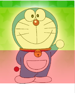
The eternal presence that is Doraemon is more head than anything else, taking up more than 50% of his height.
 Hat, the hero of Magical Hat, has a bonce that consumes 30% of his height.
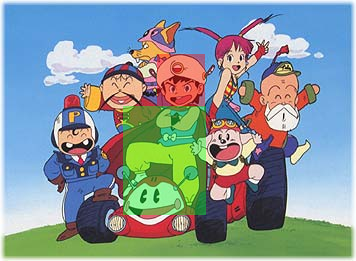
Musashi likewise has a 30% head (more if we included all his headdress)
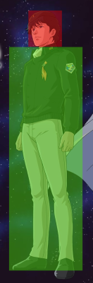
Meanwhile in the world of OAVs, Yang Wenli of Legend of the Galactic Heroes head was pretty much falling into the 1:8 ideal.
Now lets look at some of the videogame outings for these guys around this time:
As you can see in the above video, Doraemon is clearly identifiable in his NES version. Is the rest of the game in the tone/look of the franchise? Probably not, but your money maker is the Doraemon iconography.
Even though he benefits from the Megadrive’s increased capabilities, Magical Hat’s design, is more squat than the anime’s. He’s still identifiable though, and maintains all the design elements. It’s worth noting that the manga design resembles the game more than the anime.
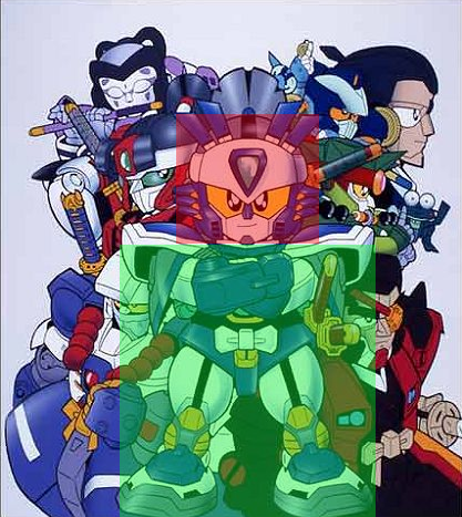
Karakuri Kengo Den Musashi Lord really displays exactly how miniaturised character designs might end up during this era. Is our stumpy samurai still recognisable in this head-heavy form? Just about.
The LOGH guys were confined to home computer strategy games for a while, eventually making it the SNES in 1992. While the portraits of the characters look a lot like the originals, they are just that, portraits. The game itself is still a text heavy strategy adventure for spods.
If you check the blog, CHOKOCAT’s Anime Video Games you’ll see that there was a vague divide to the sort of anime, the sort of game and systems they appeared on. Anime that appealed to otaku and had designs that were more realisticly proportioned, tended to appear on home computers in adventure and strategy games. Anime that appealed to the mass market and had more cartoony designs tended to appear on NES (and eventually SNES & Megadrive). Somewhere in between was that wooliest of consoles, the PC Engine.
It’s not a hard and fast rule, you’d see things like that LOGH game above on the SNES and even on the NES you’d have more realistic proportions attempted. But those attempts tended to be fairly horrific, this Sakigake!! Otokojuku game for example:
Obviously, as “Visual Novels”, the home computer anime game market survived past the deaths of the many systems that supported them during this time, and the death of the OAV market. In fact I wonder if it surplanted the OAV market to a degree? Someone who knows and cares more about those two topics should look into that.
What I do know is that we do see that market now feeding the late night/DVD/BD anime market segment with the various Visual Novel adaptations we’ve seen over the last 15 years. It strikes me as odd that a medium that developed as a way to ape anime designs more accurately, ended up decades later with character design trends that frequently translate so poorly into animation.
One video game company who do get animation character design right, is Level 5. Which is why I was quite happy for this historical post suddenly turn topical the other week when it was announced they’d be developing the new Gundam project, Gundam AGE. Obviously games systems today don’t have the same design constraints as two decades ago, but Level 5’s designs have varied proportions and more importantly they aren’t overly designed. They should transfer easily from game system to game system to animation to toys to merchandise with little need to compromise with each move.
Compare that to evolution of SD Gundam, starting as simple capsule toys versions of Gundams, the design ethic ended up frequently being more complicated than your full sized robots as they became a flurry of shiny attachments.
OK, this is drifting now. It’s like when I bought a 360 last year, all of a sudden I felt like was being called on to have an opinion on videogames again. My interest only stretches so far. Next time – TV anime, not videogames and the year 1991.